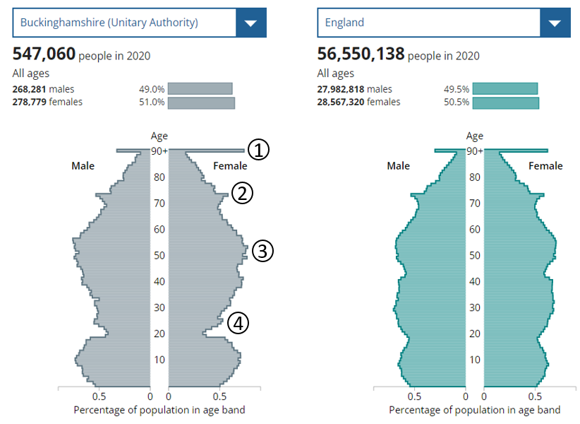

Community Safety
Nuisance calls blocked
This chart shows the number of recent nuisance calls blocked in Buckinghamshire using a blocker device. These devices are issued by Trading Standards to vulnerable
Data
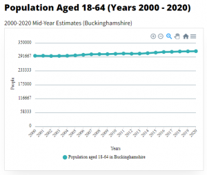
Population of 18-64 year olds
The data show how the working-age population (aged 18-64) in Buckinghamshire has changed over the last two decades and how it is projected to change
Charities & Funding
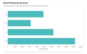
Value of Bucks grants given
This chart contains the total value of grants awarded by some of the key funders in Buckinghamshire, to Buckinghamshire based organisations. It shows how much

Data
Overweight and obese children
This data shows the percentage of overweight and obese children in Buckinghamshire, as well as comparative data from the South East and England.